|
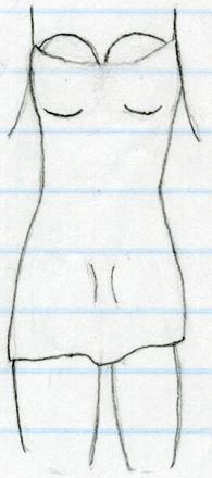
No way around it, folks. If you wanna make it financially as an artist, you have to be able to draw appealing females. Leaving the whole socio-economic morass that sheds light on for the moment, let's instead focus on the surprisingly-not-unbearable morass I made in my note margins one fine day. Probably the part I'm most proud of here is how well I've captured the folds and movement of cloth in a person's clothing, which is to say I didn't simply draw them as if they were painted on this time around. No, our model's dress doesn't look horrible, though the truncated limbs are terribly lopsided. I believe I tried to convince myself she was in mid step, which almost explains the mismatched leg thicknesses, but not how they're not quite symmetrical. And then there's the cleavage...assuming those straps reach most of the way to the shoulder, they're in approximately the right place, apart from the gravity-defying spheritude and how they're probably too close together. The half-erased nature of the little dots I made in the rough center to guide the shapes (s'all they are, honest!) is also unfortunate. I don't think the heavy lines underneath is at all right, either - it doesn't make them look defined, it makes them look leaden somehow. Bottom-heavy on top. A rather sad but necessary step in my development. At least I didn't compound her indignity by trying to give her a face - though that pelvic arrangement looks downright inconvenient. |
(Back To The Gallery)